

Celebrate King's Day! Use code GEZELLIG40 when you buy Business, Startup and Investor packages
Take me to TNW Conference →
Celebrate King's Day!
Use code GEZELLIG40 when you buy Business, Startup and Investor packages
Take me to TNW Conference →
Latest news


 DEEP TECH
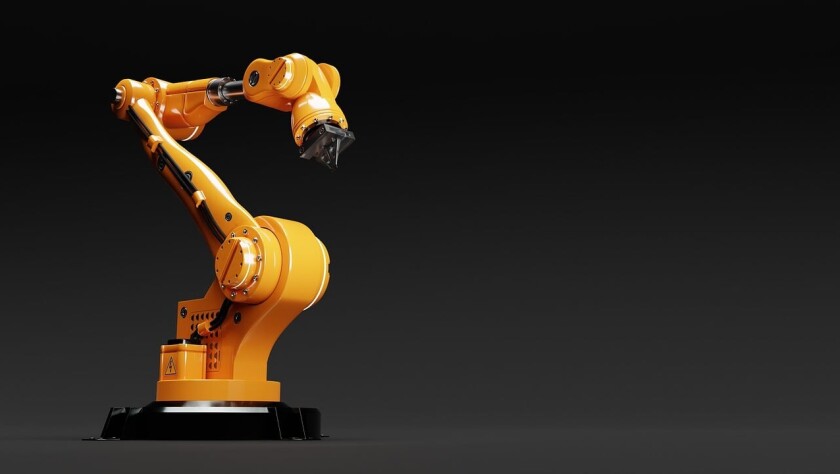
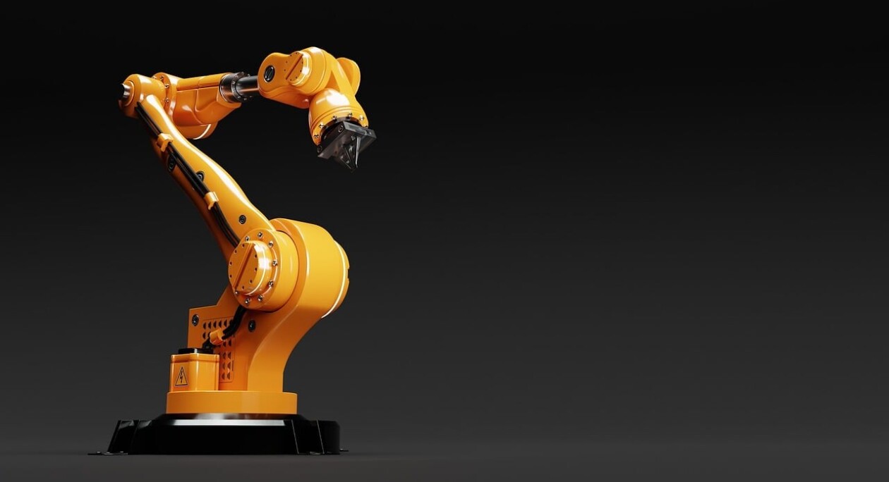
Europe taps deep learning to make industrial robots safer colleagues
The RoboSAPIENS project paves the way for more efficient and trustworthy adaptive robotics


 DEEP TECH
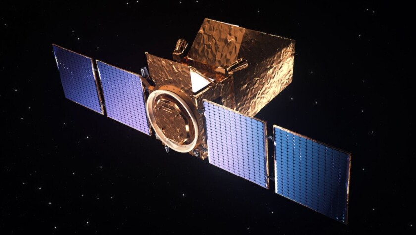
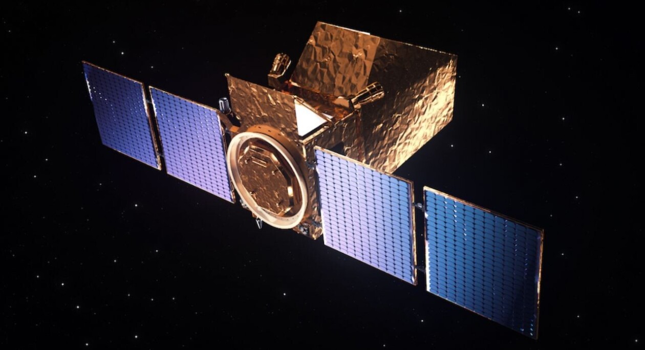
World-first satellites for commercial science set for launch in 2025
Blue Skies Space has an unusual offer for researchers


 DATA AND SECURITY
Cyberattacks on Poland surged after election of pro-Ukraine government, NetScout says
Hackivists have hit Poland hard with DDoS attacks
 DATA AND SECURITY
Cyberattacks on Poland surged after election of pro-Ukraine government, NetScout says
Hackivists have hit Poland hard with DDoS attacks


Work with us
Reach your goals
TNW takes center stage in the tech industry, offering creative media campaigns, sizzling tech events, bespoke innovation programs, and prime office locations in Amsterdam. Want to engage your audience more effectively, innovate your business, and position your brand in front of a digital-savvy audience?
Get in touch
Media

Events

Spaces

Programs


