

2 for 1 tickets are LIVE Don't miss out on the big names joining us on stage this year! This offer ends on April 22
Take me to TNW Conference →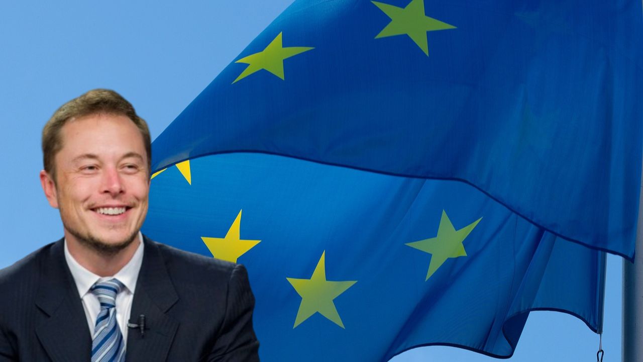

2 for 1 tickets are LIVE
Don't miss out on the big names joining us on stage this year! This offer ends on April 22
Take me to TNW Conference →
Latest news


 DEEP TECH
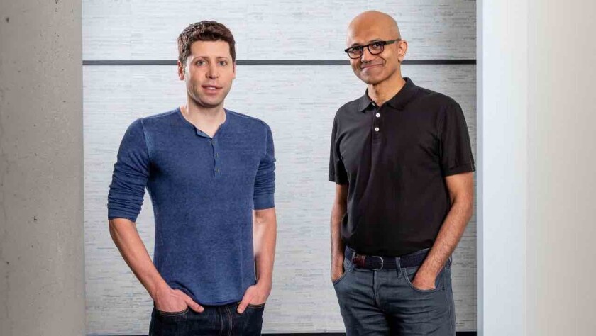
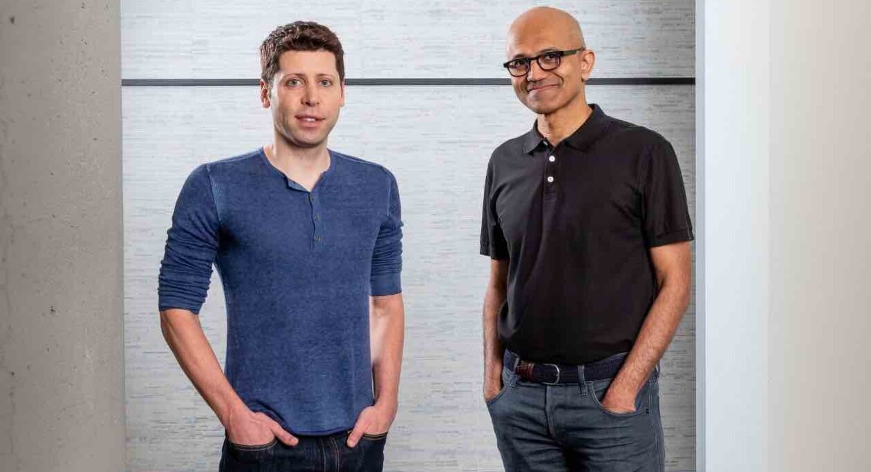
How OpenAI and Microsoft reawakened a sleeping software giant
Youth and experience have combined to create an AI superpower


 DEEP TECH
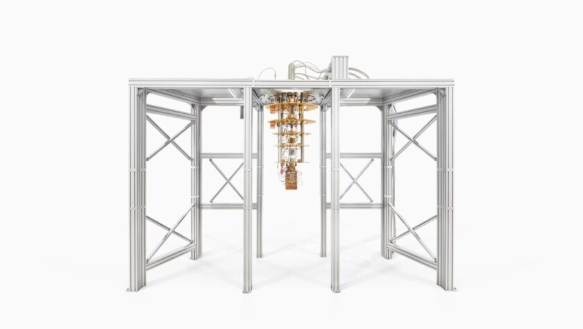
Dutch deep tech fund for photonics startups reaches €75M after second close
PhotonVentures aims to boost Europe's photonics ecosystem

 DEEP TECH
How OpenAI and Microsoft reawakened a sleeping software giant
Youth and experience have combined to create an AI superpower


 DEEP TECH
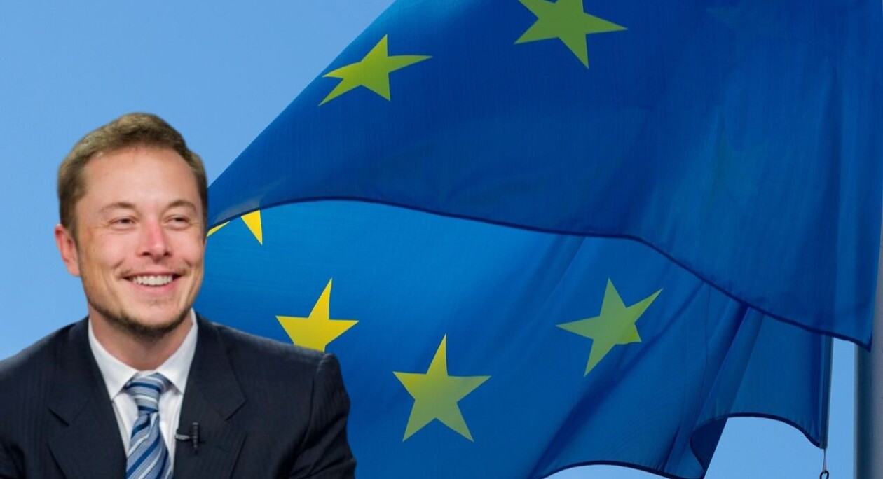
In biggest-ever election year, tech platforms are wide open for voter manipulation
To nobody's surprise, Elon Musk's X received the worst review


Work with us
Reach your goals
TNW takes center stage in the tech industry, offering creative media campaigns, sizzling tech events, bespoke innovation programs, and prime office locations in Amsterdam. Want to engage your audience more effectively, innovate your business, and position your brand in front of a digital-savvy audience?
Get in touch
Media

Events

Spaces

Programs


